BRANDING 101
This week, I will launch The Scene Room podcast. I want it to be more than just conversations about the performing arts.
I envision The Scene Room as a space where arts leaders can dive into the business side of the arts—spotlighting innovative marketing strategies, forward-thinking leadership, and the vital role of collaboration. As we explore how artists and organizations connect with their communities and shape the future, it’s crucial to have a visual identity that reflects these themes. That’s where the brand kit comes in!
A strong brand is essential for creating recognition and resonance. In this post, I’ll share how I crafted the colors, fonts, icons, and logo that bring The Scene Room to life and reflect the mission to inspire and engage.
Why Every Project Needs a Brand Kit
A brand kit is a collection of design elements—colors, fonts, logos, and other visual assets—that ensure consistency across all platforms. It helps build a cohesive identity for your project, making it recognizable and professional. For podcasts, especially in niche areas like the performing arts, branding isn’t just about looking good; it’s about making a statement and connecting with your audience in a memorable way. Here’s how I built The Scene Room's visual identity and how you can create your own.
-
Choosing Colors
 Colors play a crucial role in how people perceive your brand. I wanted The Scene Room to feel bold and innovative while still representing the elegance and tradition of the performing arts.
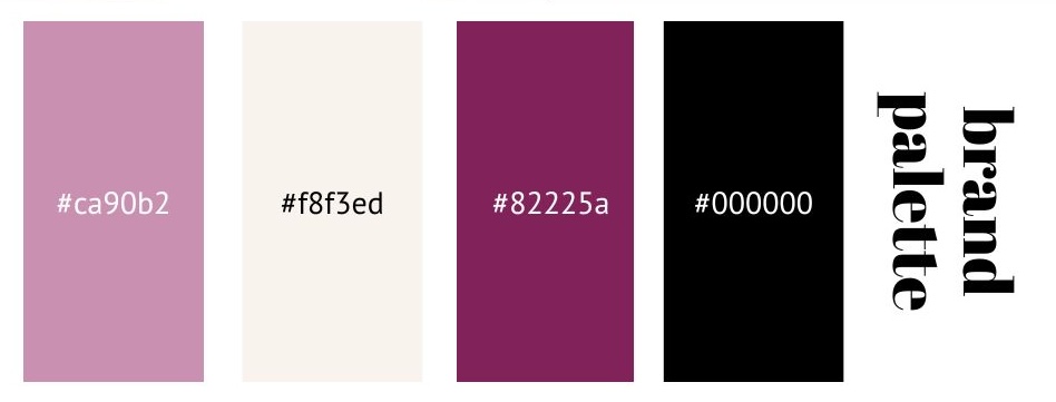
This color palette reflects that balance:
Primary Color: #82225A (Deep Plum) – This deep, rich color evokes sophistication and passion.
Secondary Color: #CA90B2 (Dusty Pink) – A softer tone to balance the intensity of the plum, adding a modern, approachable touch.
Accent Color: #F8F3ED (Off-White) – A clean, neutral shade that keeps the palette grounded and professional.
Neutral/Base Color: #000000 (Black) – A classic, powerful neutral that provides a solid foundation for the brand, allowing the other colors to stand out while adding depth and contrast to the overall palette.
When developing your own brand kit, think about how you want people to feel when they see your brand. Is it bold and energetic? Calm and professional? The right colors can instantly communicate those feelings. For a basic brand, a brand kit typically includes 3 to 5 colors (not more!): -
Selecting Fonts: Fonts play a crucial role in building a cohesive brand identity. For The Scene Room, I chose fonts that balance creativity and professionalism, ensuring the podcast’s message is clear while maintaining a polished aesthetic.

Abril Fatface is the font I chose for titles and headings. Its bold, high-contrast style commands attention, adding sophistication and a touch of theatricality—perfect for a podcast focused on the performing arts.
For paragraph text and body copy, I went with PT Sans. It’s clean, modern, and easy to read, which makes it ideal for conveying information in a simple, approachable way. The contrast between PT Sans and Abril Fatface ensures headlines stand out while the body text remains readable.
When selecting fonts, it’s important to choose ones that work well both online and in print. A strong combination of fonts not only enhances readability but also creates a cohesive, versatile brand experience.
When it comes to fonts, stick to 2—at most 3—for a simple brand kit. Simplicity is key to creating a memorable and cohesive brand. -
Choosing Icons That Tell a Story

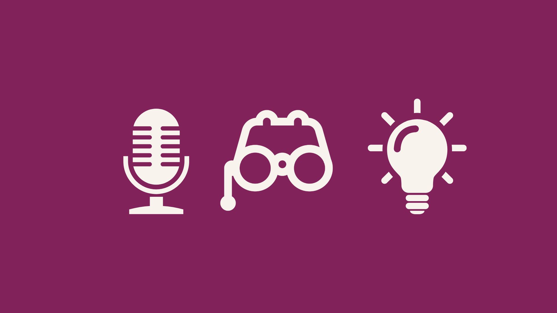
Icons are more than just decorative elements—they’re visual cues that help communicate your brand’s values and mission at a glance. For The Scene Room, I selected three key icons that represent different aspects of our focus on the performing arts and creative collaboration:
Microphone – Symbolizing the voice behind our podcast, the microphone represents storytelling, communication, and the conversations that form the core of The Scene Room.
Theater Glasses – A nod to the traditional performance space, these glasses embody the audience’s perspective, the observation of art in action, and the deep dive into the world of performing arts that our podcast encourages.
Lightbulb – A classic symbol of innovation and ideas, the lightbulb highlights the forward-thinking discussions we have around creative leadership, ideation, marketing strategies, and the future of the arts.
These icons tell a visual story that connects with the themes of creativity, insight, and audience engagement. When creating your own brand kit, think about how you can use icons to visually represent your brand’s mission. Choose symbols that resonate with your core message and that help reinforce your brand’s identity across different platforms. -
Adapting Your Logo for Different Uses

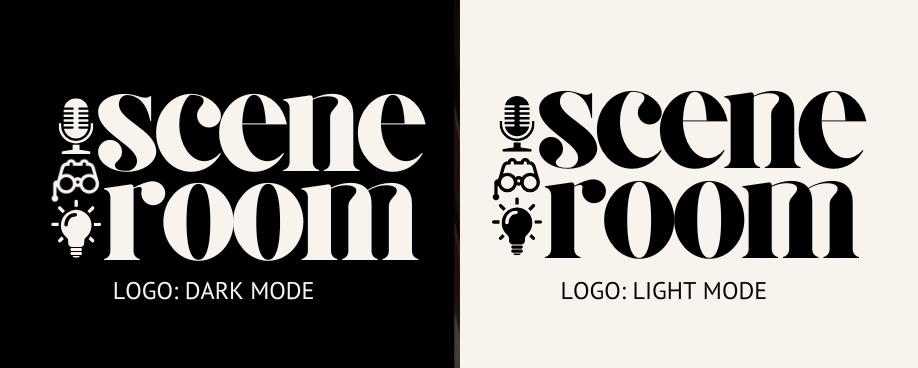
Every brand needs flexibility, especially when it comes to logos. I created two versions of The Scene Room's logo—one for light backgrounds and one for dark backgrounds. This ensures the logo looks sharp and professional no matter where it’s used.
When developing your brand kit, think about where your logo will appear. Will it be on websites, social media, on t-shirts, or promotional materials? Having versions for both light and dark backgrounds ensures consistency and clarity in any setting.
Putting Your Brand Kit to Work
Now that you’ve seen some of the elements in The Scene Room’s brand kit (I say some because there are many more aspects to consider—like language, tone, values, audio signature, and social media templates), the next step is application. Consistency is key. I will apply this brand kit across all platforms—from social media posts and podcast graphics to website design. This creates a cohesive and memorable experience for the audience.
Check out our brand kit in action by following The Scene Room on our website and/or on our social media feeds.
Ready to Build Your Own Brand Kit?
Building a brand kit is an essential part of any creative project. It helps you create a lasting impression, fosters trust, and makes your project instantly recognizable. If you're inspired to develop your own brand identity, I’d love to help! At Bowman Media, I specialize in crafting brand kits that reflect the purpose and passion behind every project.
Let’s connect and start building your visual identity today!
